Tallywag: Creating a flexible counting & wellness app
UX/UI, Branding
In 2012, personal data tracking was just picking up. Nike Fuel was gaining popularity, and Nicholas Felton was astonishing the world with his annual reports. Amidst this wave of insight, my friend Jason and I sought to create something smaller and more flexible—a tool that could adapt to users' needs.
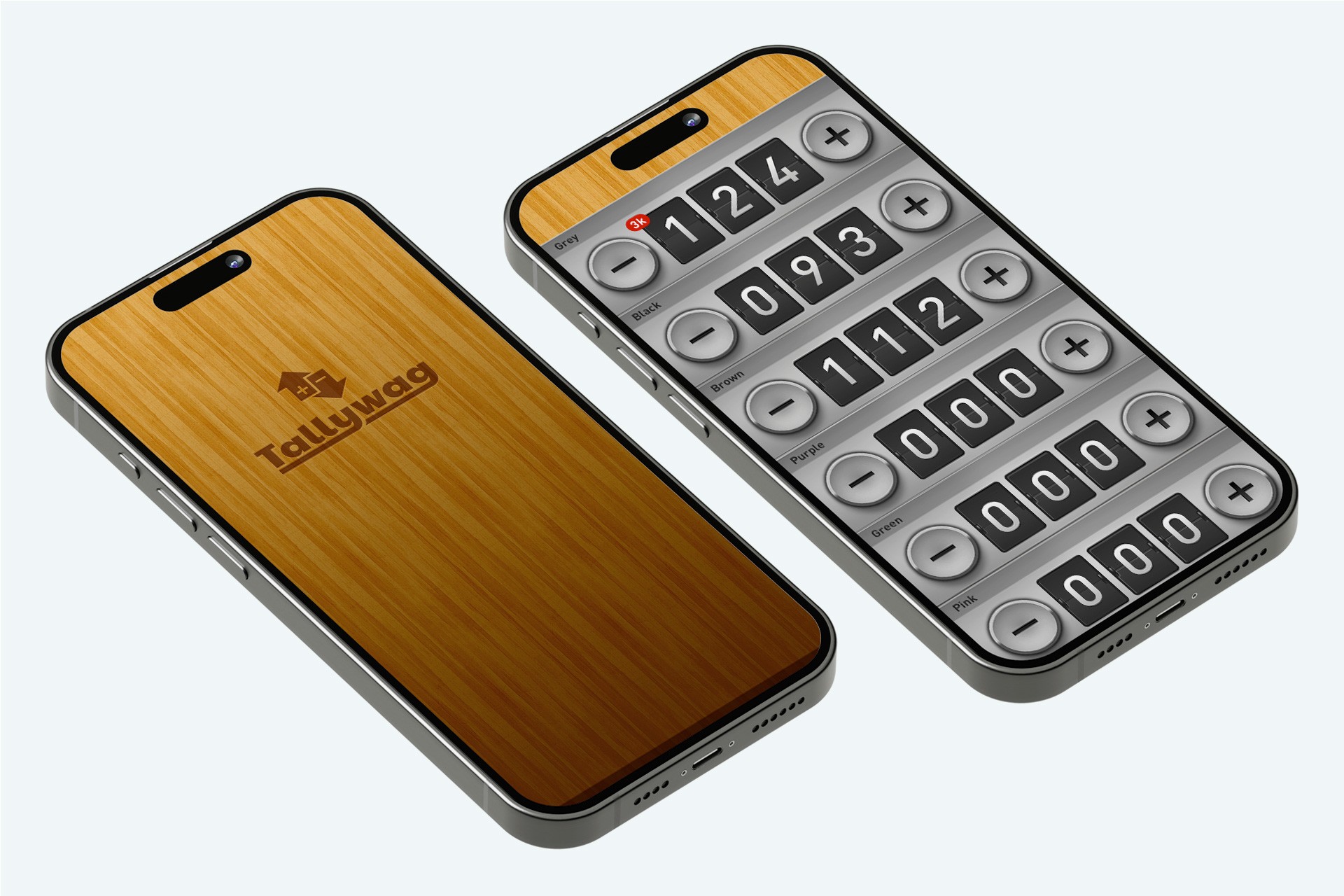
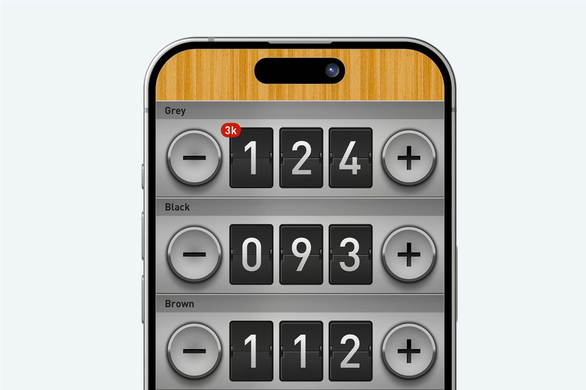
Thus, Tallywag was born—a simple counting application with unparalleled flexibility. What started as a humble counter soon evolved into a comprehensive wellness app, empowering users to track their healthy habits. With over 120,000 installs and a devoted user base, Tallywag quickly became an icon in the personal tracking space, earning praise and accolades along the way.
At the time of Tallywags release, explainer videos were a must-have for any app seeking attention. We crafted a viral video showcasing the app's versatility through humorous scenarios, starring our friends. The video garnered significant traction, complementing the app's popularity.
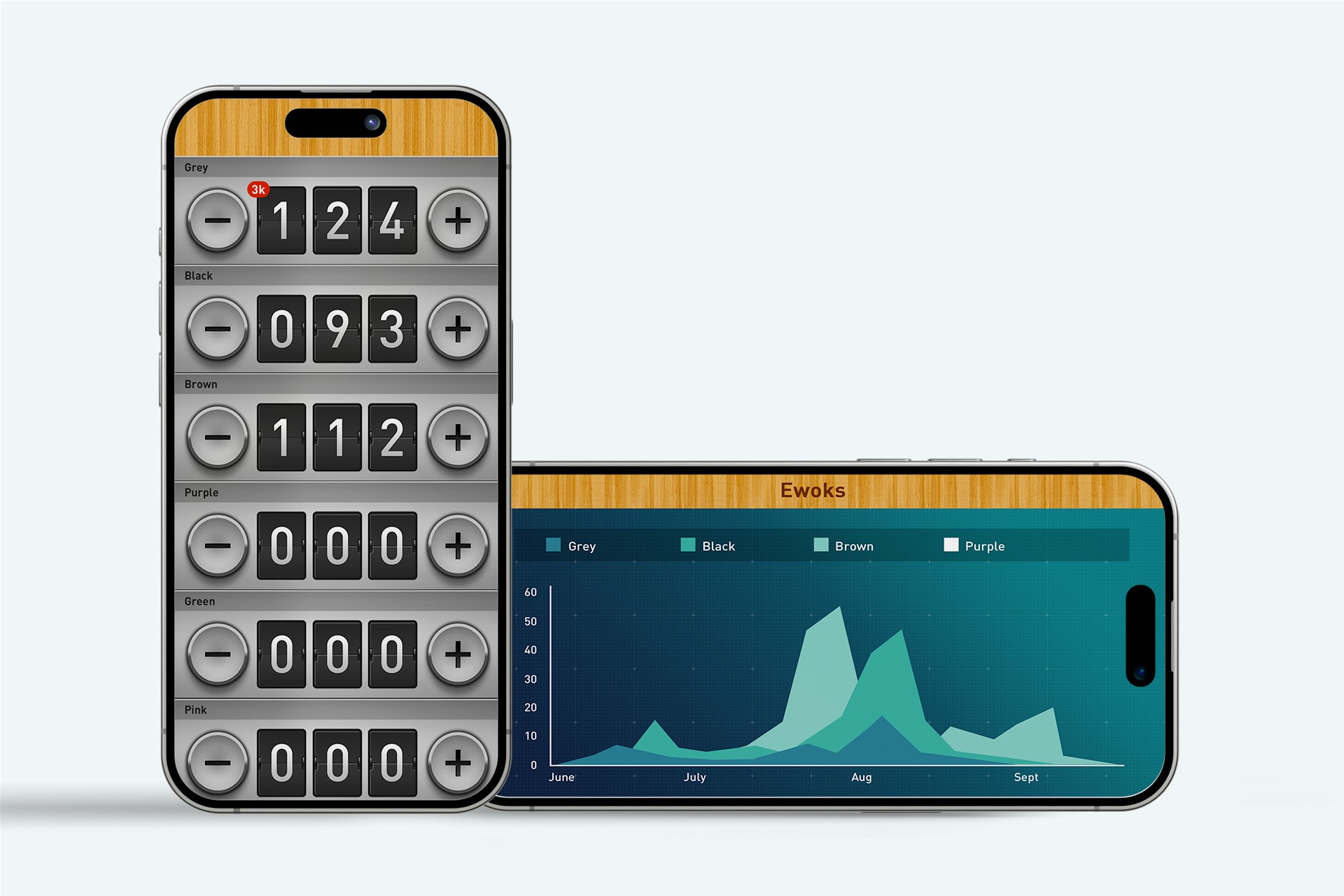
Tallywag introduced a groundbreaking feature: device rotation for enhanced data visualization. By simply rotating their device, users could explore their data in a new dimension, uncovering insights and patterns with ease. This interaction, pioneering at the time, later became a staple in other personal tracking and data visualization apps.
Our goal was to make data not only informative but also visually appealing. Tallywags elegant charts—ranging from pie and bar charts to dynamic area charts—offered users deeper insights into their habits.
Read about it in Fast Company, The FWA, Ad Age and Cult of Mac


